Digilock Brand Experience
Brand Guidelines
Logos
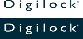
Corporate Logo
The Wordmark remains an essential identifier of our brand. It should be implemented in all markets regardless of high or low brand-awareness. The primary color for the wordmark logo is Steadfast Blue, or White when on a dark background.
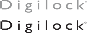
Special-use Logo Colors
Steadfast Blue and White are our signature colors, but our logo does appear in Black and Innovation Gray in specific circumstances or when necessary.
Black wordmark should only be used where color is limited by production.
Logo Clear Space
A clear space must always surround a freestanding Digilock Logo. No text or graphics should be in this area. The width of the “D” in the Digilock logo defines the specific amount of space that the logo must have on all sides (excluding the descender of the “g”), no matter where it is used.
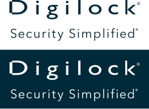
Logo & Tagline* Lockup
Where space allows and messaging is limited, the logo with tagline may be used, however, its usage is on a case-by-case basis.
Tagline should be implied in all materials.
*Note: we no longer use the tagline “Safe and Sound.”
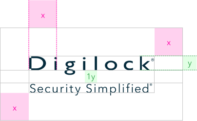
Logo & Tagline Lockup Clear Space
The width of the left edge of the “D” to the right edge of the “i” in the corporate logo defines the specific amount of space that the lockup must have on all sides (excluding descenders of “y” and “p”), no matter where it is used.
The clear space between the corporate logo and the tagline should be equal to the height of the “k” in the corporate logo, from the bottom of the “L” in the Digilock logo and the top of the “S” in the tagline.
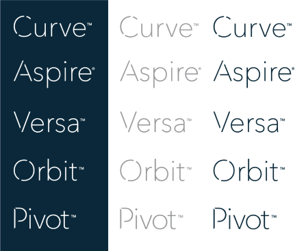
Product Logos
Primary color for Product Logos is Innovation Gray, or White on a dark background.
Product Logos in Black should only be used where color is limited by production.
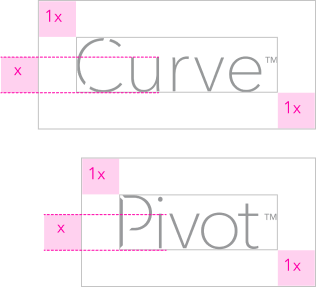
Product Logo Clear Space
The height of the first lowercase letter (excluding ascenders and tittles) of the product logo defines the specific amount of space that the logo must have on all sides, no matter where it is used. This way the logo maximizes visibility and impact.
Logo Best Practices
1.

2.
3.

4.
5.
6.
7.
Don't
- Do NOT use old logos (old logos have hollow dotted i’s).
- Do NOT tilt the logos.
- Do NOT add a drop shadow, stroke, or glow to the logos.
- Do NOT change the typeface nor try to recreate the logos.
- Do NOT distort or warp the logos in any way.
- Do NOT use logos in Innovation Gray on a dark background.
- Do NOT use the logos in a sentence.
Colors
Our color palette consists of a range of colors, with Steadfast and Trust at the center. This range of colors provide ample opportunity to create legible and accessible structure and hierarchy.
- STEADFAST
- HEX : #002A3A
- RGB : 0 42 58
- CMYK : 97 73 52 56
- PMS : 303 C 6
- TRUST
- HEX : #009ABF
- RGB : 0 154 191
- CMYK : 82 21 17 0
- PMS : 7703 C
- CREATE
- HEX : #FF6020
- RGB : 255 96 32
- CMYK : 0 77 96 0
- PMS : BRIGHT
- ORANGE C
- WHITE
- HEX : #FFFFFF
- RGB : 255 255 255
- CMYK : 0 0 0 0
- WHITE
- INNOVATION
- HEX : #96989A
- RGB : 152 152 154
- CMYK : 43 35 35 1
- PMS : COOL GRAY 7
Typography
Our brand communications use Avenir Next LT Pro in two weights: Regular and Demi. These two are usually all that is necessary to create a simple, straight-forward message. Condensed font styles should never be used.
CcDc
AaBbCcDdEeFfGgHhIiJjKk
LlMmNnOoPpQqRrSsTtUu
VvWwXxYyZz
1234567890!@#$%^&*()
CcDd
AaBbCcDdEeFfGgHhIiJjKk
LlMmNnOoPpQqRrSsTtUu
VvWwXxYyZz
1234567890!@#$%^&*()